Good interior design begins with a good house colour scheme. If the colours in your house aren’t right for the space then everything else, including the furniture, the fittings, the decorations, will look wrong. However, many people don’t realise how important colour schemes are until it is time to paint their own homes. This is a recipe for head scratching and stress over getting the paint colour combinations exactly right. Bicester Property Interiors has considered issues people may face when painting and redecorating their home and have put together this useful guide to help inspire homeowners looking to refresh their home with colour.
This guide will cover the following questions:
Interior Design: What colour should I paint my room?
How do you decorate with a colour palette?
What colours go together for decorating?
How do I choose a colour scheme?
Room colour combination ideas [infographic]
Interior Design: What Colour Should I Paint My Room?
Luckily, there are some simple questions you can ask yourself which will help when deciding what colours you should paint a room.
Interior design for different rooms
We use each of our rooms for different purposes — to entertain, to relax, and increasingly to work. What colour scheme you decide on will depend on the room’s function. Relaxing tones such as turquoise might be ideal for your bedroom, whilst yellow will create an uplifting, sunny atmosphere perfect for a kitchen or living space where you will be hosting family and friends.
Consider the room features
If the room is small with low ceilings, you may want to paint it white or off-white to create the feeling of a bigger space. Alternatively, you might want to make the same space pack a bigger punch using strong colours like orange or red. If you’re lucky enough to have period features like a tiled fireplace, you may want to incorporate that into your interior colour schemes as well.
Use lighter colours in light spaces
Continuing from the last question, it’s important to take account of how much light a room receives during the day. If the room is north facing and does not receive much light, it’s probably not a good idea to paint it in darker colours.
What colours do you like?
The best place to start is with the colours you like. After all, this is your home. It may sound obvious, but once you start worrying about all the different decorating colour schemes, it’s all too easy to lose sight of what your own tastes are. For example, what colour clothes do you enjoy wearing? A look at your wardrobe will give you a good idea of the types of colours you like, or perhaps the colours you want to avoid.
Finally, it can be helpful to think about the home as a whole. The colours you use for your living room and hallway can inform the colours you use elsewhere in the house, creating an overall house colour scheme for the ideal living environment.
How do you decorate with a colour palette?
It can be a dizzying experience thinking about house painting colour combinations, especially if it’s your first time painting and decorating your home. Even when you know which colours you want to use, how are you supposed to know how much of each colour you should use? For example, will one colour dominate? Do your wall colour combinations go with your ceilings and floors?
Use colour combinations cleverly
One simple technique to tie everything together is to move vertically from dark to light. In the natural world, we tend to experience darker colours under foot (mud, grass) and gradually move to lighter colours above our heads (the sky, clouds), and this is a good model for decorating with a colour palette too. You could achieve this technique using a monochromatic scheme, for example using a deep blue for the walls and a lighter shade of blue for the ceiling and dado rails.
60-30-10 rule
Another simple and fool proof way of deploying paint colour combinations is the 60-30-10 rule.
The idea is that 60% of the room should be your main colour. This includes features such as your walls, your sofa, and your floors. If someone took a quick glance at the room, this would be the colour they would remember.
You would use your secondary colour at 30%. The main purpose of this colour is to create contrast and can be achieved via a feature wall and an armchair.
Finally, the 10% should provide a bright pop of colour — from picture frames, cushions, a lamp, or candlestick. The easiest way to choose the three colours for the 60-30-10 method is by selecting them from the colour wheel.
What colours go together for decorating?
Like everything people don’t think about the complexity of choosing house painting colour combinations until they actually have to do it themselves. Interior colour schemes are incredibly important in constructing the atmosphere of a place, and unfortunately not every colour goes well together. As much as you might love both purple and red, we don’t recommend you combine the two as colour combinations for walls! But there are some simple tricks insiders use to come up with wonderfully complimentary colours.
As always, let nature be your guide. What colours appear naturally together in the world? For example, yellow and blue are likely to complement one another, like the sun compliments the sky. If you’re lucky enough to have a garden, spend some time looking at the colour combinations of the flowers. With their subtle pastel colours, hydrangeas provide perfect inspiration for interior decorating – like pastel blue and pearl. Working in this way will help you avoid overly artificial and jarring interior colour schemes.
Look at art. Do you have a favourite painting? Choose two colours from the composition to work as colour combinations for walls or choose three and employ the 60-30-10 method to design your whole room. It could even be a book cover or movie poster design.
There are two basic categories all colours fall into — warm or cool. If you’re choosing two colours to put together, choosing them from either the warm or the cool camp is a sure way to guarantee they fit together. Experiment with different shades of orange and yellow, or blue and green.
One of the easiest colour schemes to use is the monochromatic colour scheme? “Mono” means one, and with a monochromatic colour scheme you choose a single base colour and then any number of further variations on that base colour. The most obvious colour to use in a monochromatic colour scheme is blue — a dark blue for the furniture, and a lighter blue for the ceiling and walls.
How do I choose a colour scheme?
When deciding on decorating colour schemes, it is important to figure out what you want from the room you are decorating. Once you have decided how you imagine the room, the paint colour combinations should follow. For example, if you are creating a room for private relaxation like a bedroom, keeping this in mind will help you narrow down the colour scheme options – electric pink and lime green will probably be out. Then again, if you’re wanting to create a lively space for entertaining friends, a zappier colour scheme might be just what you need.
Knowing some simple rules about paint colour combinations can help you achieve your desired effect. For example, colours next to each other in the colour wheel tend to create a more mellow effect when placed together, which would be suitable for a bedroom, bathroom, or study.
You can also start from what you already have. Do you have a brightly coloured sofa or a rug with a striking pattern that you intend to use in the room? One easy way of choosing a colour scheme is to start with something in the room that’s already eye-catching and work out from there.
Seek out inspiration online. The sheer amount of information online can sometimes be overwhelming, but on the flipside there’s a huge amount to be learned from what’s available. Using visual sites like Pinterest and Instagram can be a great way to find interior design inspiration. On Instagram you will find profiles dedicated to interior design which are regularly updated, ensuring that your colour scheme is fashionable and not out-of-date. You can also check out celebrity profiles to see how their homes are decorated. If you feel a particular affinity for an actor or actress, maybe their interior design will work for you. Then again, if offline is more your thing, you could also browse interior design magazines at the local supermarket.
Remember you don’t have to reinvent the (colour) wheel. It’s important to remember when decorating your home that there are plenty of tried and tested house painting colour combinations that will still be fashionable 100 years from now. The warm reds and yellows the Romans used to decorate their villas still look good to us in the 21st century, whilst the beiges and browns that were popular in the 70s are only just coming back into fashion. This is because our eyes naturally enjoy the combining of certain colours, and if you’re unsure about the latest colour schemes, it may be better to opt for something classic.
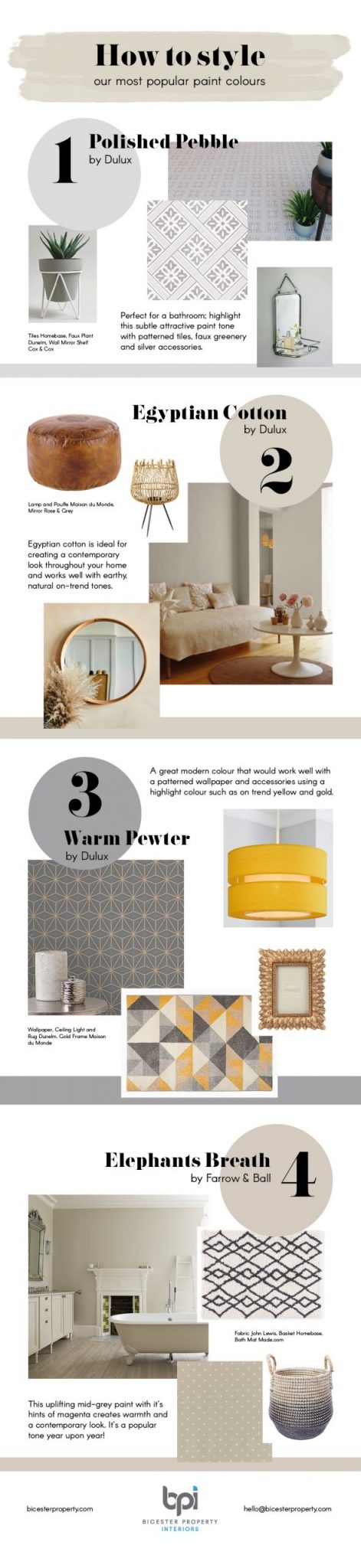
Room colour combination ideas
If you’re still stuck and need some help, check out our colour combination recommendations below.